By Maven Road
Companies that prioritize social media data usage and analysis know it provides valuable information that not only helps them to understand their clients and identify new opportunities and challenges, but also allows them to answer questions that they didn’t even know they had in the first place. Social media data is increasingly being used by companies to inform business decisions and drives strategy. The breadth and depth of the data available to every company, not just those with money to spare, has been transformative in many industries. Now that most social media data is widely available for public consumption, the effective use of data is becoming the new basis of competition.
But deciphering the data and uncovering powerful insights requires considerable expertise. And the analysts responsible for this challenging work rely on data visualization and visual analytics to execute their work efficiently and accurately. Each plays an important role in data exploration: Data Visualization helps you identify problems and Visual Analytics helps you solve them.
What is Data Viz?
Data visualization is the art of representing data in a visual format. It is the ability to convey information and tell a story without using words, by highlighting the most valuable data points and removing the noise.
Data visualization makes it easier to identify trends and patterns among data that may be difficult to discern from a spreadsheet. It also grabs people’s attention and keeps their eyes on the message. It should be straightforward and intuitive. If the visualization is too confusing, it becomes ineffective in conveying the data.
To highlight the utility of data visualization in identifying trends and other insights among the data, let’s imagine that you work in the fashion industry, and you want to determine which brand among Forever 21, H&M and Urban Outfitters received the most Twitter mentions, by year, during the period from 2017 to 2018. First, compare the mention values per year among each brand by using this chart:

Table 1: Twitter Mentions
Now make the same comparison with a graph:
A visual representation of the data allows us to more quickly compare among the three brands to determine which performed the best in terms of mention volume per year. Additionally, it helps us identify anomalies. For example, using the graph, it is easy to observe that H&M had an incredible surge in mentions in 2018. And this, of course, would prompt us to ask, why?
While we’re unable to answer that question using this particular data visualization, it is important to note that the question itself was provoked as a direct result of having seen the data depicted graphically. To determine what is causing the anomaly, you would need to conduct further analysis into the data. A new type of data visualization can assist in this process, one which is dynamic and displays different types of variables and cuts. This is where visual analytics comes into play.
What is Visual Analytics?
Visual Analytics is the process of combining computer programming, interactive data visualization and analytical reasoning in order to gain knowledge from complex, conflicting and dynamic information.
The main uses of Visual Analytics are the following:
- Show different cuts of data
- Represent large quantities of information in a reduced space.
- Find pattern or trends in data.
- Retrieve, browse and explore data.
Visualizations are created taking into account the capabilities and limitations of the human visual system. They are also interactive so that analysts can explore the data and uncover new knowledge and insights.
Tools or software like Tableau are necessary to execute Visual Analytics.
How does Visual Analytics Work?
The first step of visual analytics is preprocessing the data, which includes filtering and transforming it into the desired format for further investigation. This process improves the quality of the data and removes noise that can alter the results of studies that are going to be based on it. Then, the data is processed using mathematical, statistical and data mining algorithm models. Finally, visualization highlights the important information, including commonalities and anomalies, making it easy for an analyst to uncover new insights previously unobserved in the data.
To really understand why visual analytics it is better than using a simple spreadsheet, let’s continue with the example presented in the data visualization section, above. In that scenario, we were analyzing mentions from three mainstream retail fashion companies to see which one had the most mentions from 2017-2018: Forever 21, H&M or Urban Outfitters. From first glance, we could see that H&M had the most mentions in 2018; however, if we are given additional data, including mentions by month and day over the course of that year, and the sentiment of those conversations, a simple graph will not be enough to illustrate trends and patterns among the data. For that reason, we created a simple dashboard on Tableau to review the information:
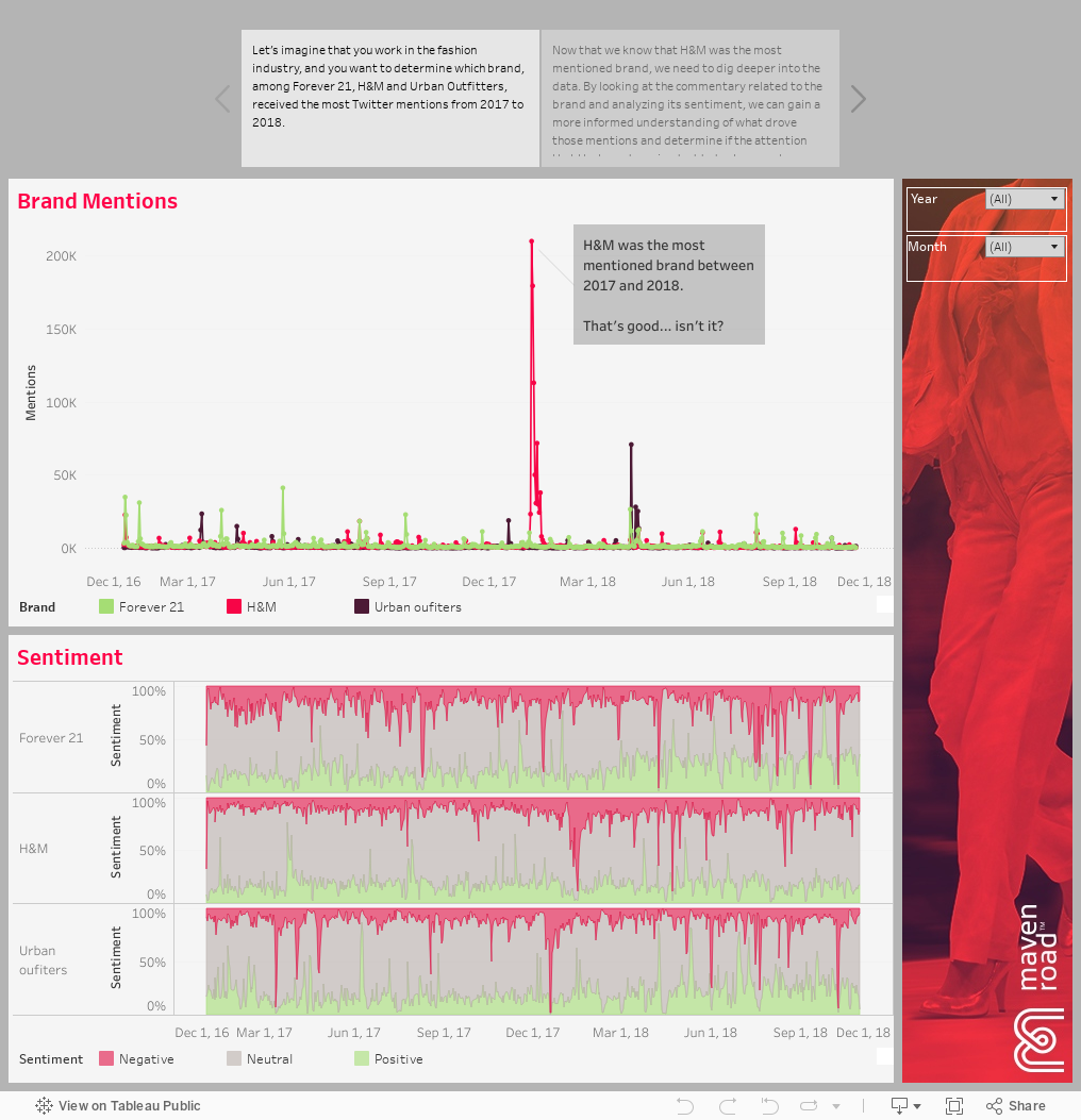
On the data analytics platform, we are able to look beyond just the mention numbers and provide additional layers of complexity to understanding the data. We explore the major themes driving conversations about H&M in 2018, at the time that mentions of the brand skyrocketed, as well as the sentiment of the posts, to determine the impact of the attention received by the brand. We discovered that an incident involving a sweater design drove considerable negative mentions about the brand. These, and insights like it, are invaluable pieces of intelligence for marketers and brand managers.
Conclusion
We live in the digital era, and this has opened up new opportunities for companies of all shapes and sizes to have access to data that help inform more impactful business and marketing strategies.
However, we are visual creatures, and this has obligated companies to find a better way to process data, since looking it in a spreadsheet won’t always allow us to make connections and decipher meaning from those numbers. That is why data visualization and visual analytics have become such critical tools for working with data.